It's not easy being green
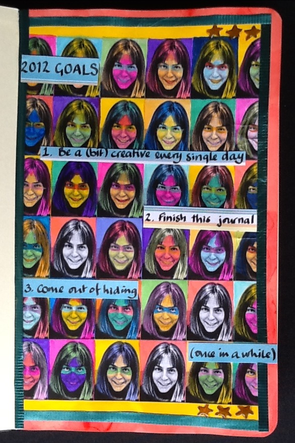
I wanted to have a go at art journalling. Unfortunately I am a year late for the UK Stampers Art Journal Challenge which took place over 2011. However, Efemera's prompts there seemed so good, that I could not see any reason for following them one year later. This is my first attempt, and...well...it wasn't what I was aming for.
Efemera's prompt for week 1 is as follows:
"A new year and a new start so this weeks prompt is GOALS, use this in anyway you wish. Your page must include:
1 Three things you want to achieve this year
2 Handmade background paper
3 A photograph"
1 Three things you want to achieve this year
2 Handmade background paper
3 A photograph"
I am not sure whether or not the prompt was literally paper made by hand or a background to which you had contributed, as opposed to one you had just used from a designer pack. I wanted to combine 2 and 3 to produce an Andy Warhol effect. I found a usable photograph and then using Snapseed on the iPad and Microsoft Paint on the computer, I turned it into a tiled black and white background.
Me and my boys
Too many faces
I then coloured in the faces, in bright Windsor & Newton inks, Art Kure watercolour pens and Derwent watercolour pencils. To link in with the third 'goal' I was trying to give the faces masks à la 'The Incredibles' superheroes. However, as I was painting them, the younger of my sons pointed out that the faces just looked creepy. He was right.
Too many creepy faces
I left three faces in black and white, both to indicate that these individuals were not behind masks, not hiding and also because there was simply no way to colour them now without them also joining the witch, troll, vampire and zombie line up.
Moleskine journal page was too porous
I did not think things could get much worse, but, of course, if it is all going badly, it is downhill all the way. My new and expensive Moleskine sketch journal was a hopeless choice for mixed media. Probably perfect for pencil sketches, the paper (which I had masked all round with post-it notes, proceded to suck up my inks and plaster them on the other side of the page). Naturally the pages had not been stretched, so as soon as they dried, they took on a wave.
I stamped a few stars with a tiny clear stamp (well this was meant to be a stamping project!) and coloured those in with a Sakura gel pen, embellishing with Glossy Accents. Finally I stuck some recycled ribbon around the edges, mainly for a bit of texture. I used my favourite pen in all the world (an original
Parker 51 with an italic nib given to me by my father) to write the
journalling on separate (less porous) paper. I tried to keep the journalling loose and informal, but I was tense by this point and it probably shows. Finally, I set about placing the journalled pieces strategically to cover up the most scary of the faces.
Although the end result wasn't what I was trying to achieve, starting something new always involves a learning curve. Anyway, if you rip up everything you produce that displeases you, after a while you become too paralysed with fear of failure to even attempt something new.
Ingredients for 2012 Art Journal, Week 1
Moleskine sketch journal (good for sketches, not good for getting wet)
Microsoft Paint on the computer, Snapseed photo-editing software on the iPad
Art-Kure watercolour sketch brush pens: various colours
Windsor & Newton inks: various colours
Caran d'Ache Supracolor soft watercolour pencils: various colours
Craft central clear star stamp
Ink It Up 'Light Chocolate' pigment ink stamp pad
Sakura 'bronze' gel pen, Inkssentials Glossy Accents
Recycled ribbon


I think you did a fantastic job really like the look of the faces. Love it!!!
ReplyDeleteThis is just fab Kaowyn, a great way to use a photo!! lainey x
ReplyDelete