Monday, 27 February 2012

Secret postcards

Caught stealing an egg

Art Deco lady

My younger son's school is fundraising at present and has used the Royal College of Art's idea of having a secret postcard sale.  Ideally, they'd like known artists or celebrities to contribute cards, but were asking anyone who could pick up a pencil to have a go.  These were my contributions.  They lady should/could have been more delicate, but the markers bled slightly more than I was expecting on the postcard paper.  By the time I drew the fox, I was anticipating this, so I used a Chinese brush pen and rather than trying to include more detail, I just tried to make fewer lines work harder by varying the thicknesses.  My inspiration was Art Deco postcard work, as those artists gave such expression in few lines and fewer colours.

Ingredients for Caught stealing an egg
Pentel Chinese calligraphy brush pen
Letraset Tria marker in orange O567
Pentel white gel pen for highlights in eyes; other white areas are just the white of the card

Ingredients for Art Deco lady
Steadtler triplus fineliner in brown
Letraset Tria markers: red R766, blue V245, orange O567 and skin tone O729

2012 Art Journal, Week 6 - Friends

Friends

 Efemera from UK Stampers says:

"This week your prompt word is FRIENDS
1 Who, when where?
2 What is your most memorable 'friend' story?
3 Use some kind of stencil decoration on your page"

The stencilled panel at the top left started this page.  It reminded me of sunshine on grass and an occasion when a friend invited me over to stay in Holland and work on a horse therapy farm for a week.  When I look back, I still see it as a bright gem attached to some very dark cloth.  It enabled me to give some perspective to the events that I was going through at the time.

I wanted the page to be reminiscent of hard work outdoors in bright sunshine, with slightly scorched grass, dry sand schools and slightly skittish horses with snorting noses and warm, dusty flanks.

Ingredients for Friends
Sunflower stencil (origin unknown)
Anita's horse stamp
Blade Rubber Stamps horse stamp
Sunflower stamp (origin unknown)
Distress ink in 'spiced marmalade' and 'vintage photo'
Letraset Tria markers: greens G136 and G356, brown O346, orange O567
Letraset Metallic markers in silver and gold
Zebra Jimnie gel pens in silver and gold

Beware the Weeping Angels

Weeping Angels, scariest Dr Who baddies ever?

My youngest son is a HUGE fan of Weeping Angels.  If you haven't come across them before, they are Dr Who menaces who first appeared in the episode Blink, back when David Tennant was around.  Essentially they work by plunging you in the past to live out your life there, whilst they steal the energy of your potential future.  This isn't really what makes them so scary.  

They are terrifying because they can only move when you aren't watching them. "In the sight of any living being, they literally turn into stone.  And you can't kill a stone.  Of course, a stone can't kill you either, but then you turn your head away.  Then you blink.  Then, oh yes, it can...  Don't even blink.  Blink and you're dead.  They are fast, faster than you could ever believe.  Don't turn your back, don't look away, and don't blink!"

A visit to possibly the loveliest store in London Blade Rubber Stamps (opposite the British Museum) saw me spending far too much and buying some new rubber stamps.  The main feature of this card is an Aubrey Beardsley angel, from Blade's own collection.  It was obviously crying out to be a Weeping Angel, so I made it one.  The torn wallpaper message is also a reference to Blink, where the heroine of the episode is warned by finding a message under ancient wallpaper in an abandoned house.

Inside the card - really duck Sally Sparrow, duck now

As cards go, this one took me a while.  It was difficult to get the different elements to gel.  As soon as I put the message on the front, it stood out too strongly and stole from the angel.  I used Tria markers on the angel image and background to try to link the pieces with colour, but the angel still seemed to drift into the background.  I solved this by using Glossy Accents on the angel to make it stand out.

Ingredients for Weeping Angel
Beardsley Angel stamp - Blade Rubber Stamps
Distress Ink in "chipped sapphire"
"Wallpaper effect" paper free from a magazine, matted onto black/gold tissue card offcut (and black/gold tissue paper inside)
Letraset Metallic marker in green
Letraset Tria markers: pink R327 and green G136
Pentel Chinese calligraphy brush pen
Zebra Jimnie gel pen in silver 
Inkssentials Glossy Accents

Tuesday, 14 February 2012

2012 Art Journal, Filled with Love

Filled with love

Names of loved ones in the heart

The Craft Barn has a journal challenge on at the moment which my good friend Lainey from Cardmaking Paradise recommended to me.  The Craft Barn challenge can be found here but I hope they won't mind me repeating the challenge, which is as follows:

"The theme this time is "FILLED WITH LOVE".

What we will ask is to draw/stencils/die-cut hearts and "fill" them with what you love... It can be pictures of your loved ones... your favourite colours... favourite food... favourite movies.... Anything/one you love and want to journal about should be INSIDE the hearts... The rest is up to you..."

I should add at this point, that hearts are generally just "too cute" for me, so the challenge presented a problem.  However, I loved biology at school and decided I could deal with the cute by drawing an anatomical heart.  Using a biology reference book and several diagrams on the internet, I freehand drew this heart in pencil and then in pigment liner and then labelled it.  I coloured it with Letraset Tria Markers and then used Staedtler triplus fineliners to journal the names of people I love inside the heart atriums and ventricles (as per the instructions).  This is the first time I have used the Tria Markers properly.  The work of ArtyRosie, a friend from UK Stampers, was very persuasive in tempting me to try markers and I must say I have been impressed at how easy and bright they are, although I have a lot to learn in terms of shading.  Links to the websites of both Lainey and Rosie can be found to the right of this page and I highly recommend both blogs.

Ingredients for Filled with Love
Daler Rowney Manga Pad paper
Letraset Tria Markers: blues B845 and B138, red R354, pink R327 and pale pink O518
Staedtler pigment liner: 03
Staedtler triplus fineliners: dark green, light green, orange, blue, red

2012 Art Journal, Week 5 - Perfect Day

Perfect Day

Efemera from UK Stampers had the following to say about Week 5:

"This week's prompt is PERFECT DAY
1 What is/ would be your perfect day?
2 Include a picture on your page
3 Use some stamping on your page"

I like to tone my photographs down a little if I am using them in collage work, as they can appear a bit too bright and "I'm-a-photograph-look-at-me" for journal work or card making.  It really depends on the look you are trying to achieve, but here, I wanted a more vintage effect.  I used Snapseed on the iPad to make the picture of James and Storm "vintage" and the picture of the boys "dramatic".  After printing these out, I used circular and oval punches on them, triming the sides of James and Stormy to be able to fit the keys in.

I was aiming for vintage and can trace the brown and orange colour scheme back to a card of Beanie's on UK Stampers, whilst the lime green contrast colour was a fashion website influence, Escada maybe...all too expensive for my blood, but beautiful to look at.  Having stamped the keys and clocks, I did the main journalling.  I felt the background still wasn't broken up enough, so I stamped various smaller round and oblong stamps among the keys and the journalling.  Then I begun doodling.  I doodled on every part of the page and loved every moment of it.

Ingredients for 2012 Art Journal, Week 5
Moleskine sketch journal
Key, clock and various round and oval stamps from various sources (I'm sorry, I just don't know where any of them came from, there are no markings on them) 
Distress Ink ink pads in "spiced marmalade" and "tattered rose"
Microsoft Paint on the computer, Snapseed photo-editing software on the iPad
Staedtler triplus fineliner sets of pens (colour and pastel): brown, steel, orange and lime green

Calligraphy and poetry

Arthur, a poem written to a loved one 
on the death of her husband

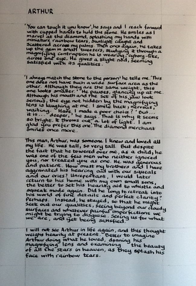
I wrote this prose poem just under a year ago, on the death of a lovely man.  He and his wife were close friends of my parents and, accordingly, he was part of my life for as long as I can remember.  His widow asked me to write the poem out in italics and it has taken me a while before I was able to do this.  I tried before and just failed miserably.  I couldn't face it.  Also, I am just not good at calligraphy.  I find it very hard and my results are anything but perfect, especially if, as here, the work requires more than a few words or phrases.  Just in case you are interested in the words, I repeat them below, to save you struggling through my writing.  I wrote using my Parker 51 on a Daler Rowney Manga Pad.

ARTHUR

'You can touch it, you know', he says and I reach forward with cupped hands to hold the stone.  He smiles as I marvel at the diamond, splashing my hands with miniature rainbow tears, sunlight caught and scattered across my palms.  Then, once again, he takes up the gem in small tweezers, studying it through a magnifying contraption he is wearing, cyborg-like, across one eye.

'I always match the stone to the person' he tells me.  This one does not have such a wide surface area as the other.  Although they are the same weight, this one looks smaller.'  He pauses, glancing up at me.  Although his mouth and the set of his jaw look serious, the eye not hidden by the magnifying lens is laughing at me.  I smile back, nervous, waiting.  Have I made a poor choice?  'But...it is...deeper,' he says.  'That is why it is so bright.  It throws out a lot of light.  I am glad you prefer this one.'  The diamond merchant smiles once more.

This man, Arthur, was somone I knew and loved all my life.  He was tall, so very tall.  But despite the fact he towered over me, as a child he was one of the few men who neither ignored you, nor treated you as one.  He was generous and patient.  How must my brothers and I have aggravated his hearing aid with our squeals and our cries?  Unrepentant, I would later return to his home with my own small sons, the better to set his hearing aid to whistle and squeak mode again.  Did he long to retreat into his world of fine details and perfect clarity?  Perhaps.  Instead, he stayed, so that he might seek out our qualities, seeing beyond our cloudy surfaces and whatever painful imperfections we might be trying to disguise.  Seeing us for what we are, and yet being satisfied.

I will not see Arthur in life again, and this thought weighs heavily at present.  Better to imagine Arthur doing what he loved, donning his magnifying lens and examining the beauty of all the stars in heaven, as they splash his face with rainbow tears.
How do you keep a perfectly straight line?

Even with lots of pencil lines to guide you, keeping a straight line when writing large sections of text is tricky.  I think having lines underneath would help, but when I tried, I couldn't see through the paper.  Perhaps I should have measured every line out and drawn it in pencil on the paper.


Attempt 2 was complete, but I managed to splash a drop of water on it when I was erasing the pencil marks
  
Here is my desk with completed work 
plus attempts 1 and 2
  
Recycle failed attempts card

Rather than waste the failed attempts, I stamped leaves all over them and turned them into a card to accompany the caligraphy.  

Ingredients for calligraphy prose poem
Parker 51
Quink blue black ink
Daler Rowney Manga Pad paper

Ingredients for calligraphy card
Santa Rosa leaf stamped on failed calligraphy attempts
Distress Ink "spiced marmalade" ink pad
Copper card stock
Letraset Metallic Marker in "red gold"
Letraset Tria Markers: green (G136), orange (O567), yellow (Y337)

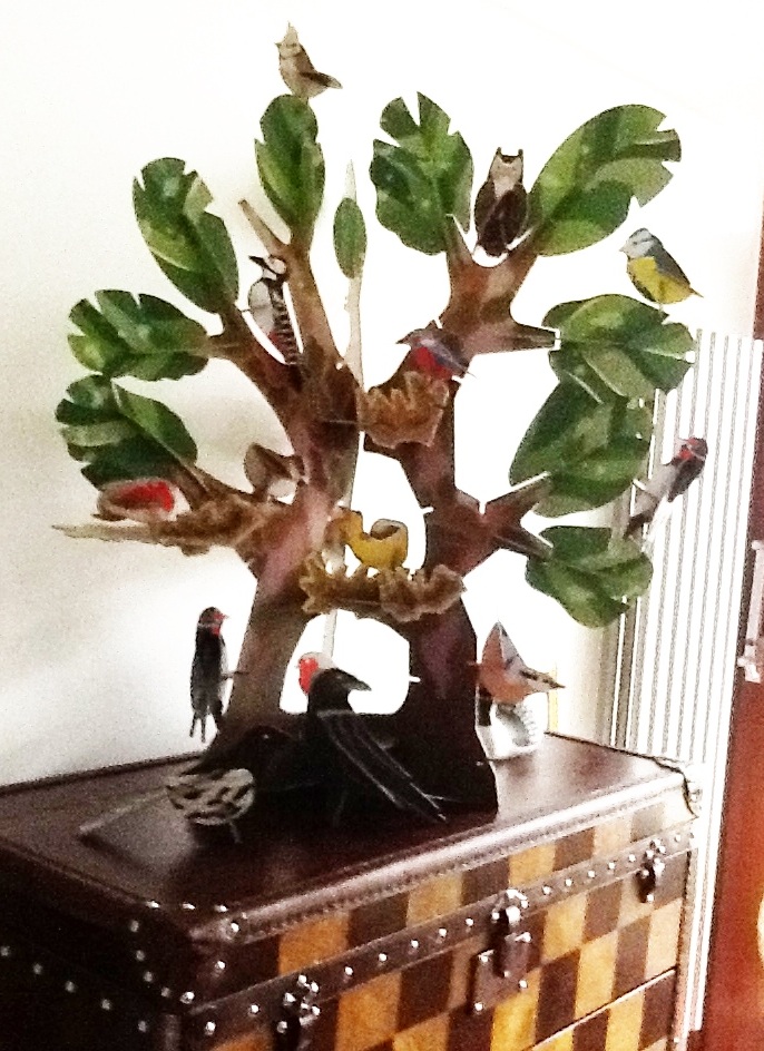
Cardboard trees and sleeping cats

Cardboard tree

Cardboard birds (plus wooden duck)

My younger son and I spotted a brilliant cardboard tree which we thought would make a great addition to the boys' room.  Assembly took...rather longer than anticipated, but here it is, fully assembled on top of one of their chest of drawers.

Let sleeping cats lie

In other news, the cats have been sleeping again.  From top to bottom, Nut, Mouse and Stormy.