Monday 23 January 2012

2012 Art Journal, Week 1 - Aiming for Warhol, achieving extras in Wicked

It's not easy being green

I wanted to have a go at art journalling.  Unfortunately I am a year late for the UK Stampers Art Journal Challenge which took place over 2011.  However, Efemera's prompts there seemed so good, that I could not see any reason for following them one year later.  This is my first attempt, and...well...it wasn't what I was aming for.

Efemera's prompt for week 1 is as follows:
"A new year and a new start so this weeks prompt is GOALS, use this in anyway you wish.  Your page must include:
1 Three things you want to achieve this year

2 Handmade background paper
3 A photograph"

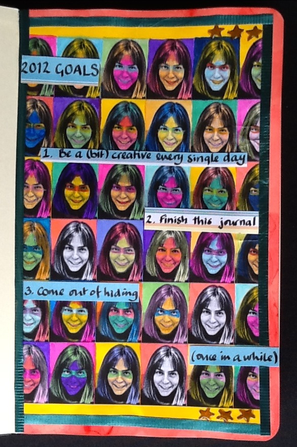
I am not sure whether or not the prompt was literally paper made by hand or a background to which you had contributed, as opposed to one you had just used from a designer pack.  I wanted to combine 2 and 3 to produce an Andy Warhol effect.  I found a usable photograph and then using Snapseed on the iPad and Microsoft Paint on the computer, I turned it into a tiled black and white background. 


 Me and my boys

Too many faces

I then coloured in the faces, in bright Windsor & Newton inks, Art Kure watercolour pens and Derwent watercolour pencils.  To link in with the third 'goal' I was trying to give the faces masks à la 'The Incredibles' superheroes.  However, as I was painting them, the younger of my sons pointed out that the faces just looked creepy.  He was right.


Too many creepy faces

I left three faces in black and white, both to indicate that these individuals were not behind masks, not hiding and also because there was simply no way to colour them now without them also joining the witch, troll, vampire and zombie line up.

Moleskine journal page was too porous

I did not think things could get much worse, but, of course, if it is all going badly, it is downhill all the way.   My new and expensive Moleskine sketch journal was a hopeless choice for mixed media.  Probably perfect for pencil sketches, the paper (which I had masked all round with post-it notes, proceded to suck up my inks and plaster them on the other side of the page).  Naturally the pages had not been stretched, so as soon as they dried, they took on a wave.

I stamped a few stars with a tiny clear stamp (well this was meant to be a stamping project!) and coloured those in with a Sakura gel pen, embellishing with Glossy Accents.  Finally I stuck some recycled ribbon around the edges, mainly for a bit of texture.  I used my favourite pen in all the world (an original Parker 51 with an italic nib given to me by my father) to write the journalling on separate (less porous) paper.  I tried to keep the journalling loose and informal, but I was tense by this point and it probably shows.  Finally, I set about placing the journalled pieces strategically to cover up the most scary of the faces.

Although the end result wasn't what I was trying to achieve, starting something new always involves a learning curve.  Anyway, if you rip up everything you produce that displeases you, after a while you become too paralysed with fear of failure to even attempt something new.  

Ingredients for 2012 Art Journal, Week 1
Moleskine sketch journal (good for sketches, not good for getting wet)
Microsoft Paint on the computer, Snapseed photo-editing software on the iPad
Art-Kure watercolour sketch brush pens: various colours
Windsor & Newton inks: various colours
Caran d'Ache Supracolor soft watercolour pencils: various colours
Craft central clear star stamp 
Ink It Up 'Light Chocolate' pigment ink stamp pad
Sakura 'bronze' gel pen, Inkssentials Glossy Accents
Recycled ribbon

Sunday 22 January 2012

Seahorse Birthday Card

Seahorse birthday card for William

My brother William is mentally handicapped.  He likes happy colours, especially bright, joyful pink.  Accordingly, in anything I make for Will, I always try to include a bit of pink.  The year before last I knitted him a forest green scarf, which included pink details at the edges.

The background of this card is a combination of pattern origami paper, a dark blue piece of insurance advertising literature (guess whose insurance has just come up for renewal?) and offcuts.  I layered a few pink, red, purple and gold offcut/recycled anenomes on the the background.  Then I stamped and embossed the seahorse, before backing it and hanging it on ribbon.  The embossing was weak (perhaps the embossing ink is getting a bit old), so I touched up sections with gold ink.  I then covered the background section in recycled pink netting and layered over that with more anenome pieces.  The sentiment came free with a magazine, but I jazzed it up with Glossy Accents.  Finally, I mounted everything on pearlescent blue cardstock.

When the card is held, the seahorse on its ribbon (and the seahorse's googly eye) both move behind the rustling anenomes and the netting, which I am hoping invokes an underwater feel.  If I am honest, I think that the colours and patterns are too diverse, too disjointed to work as a whole and overall the image is way too 'cute' for my liking.  That said, I think William will like it, and that is all that really matters.

Ingredients for Seahorse:
Foam seahorse stamp (no details on the stamp itself but I am fairly sure I got it from Craft Central)
Top Boss 'Tinted' embossing stamp pad, Stamp-n Stuff 'Jewelled Gold' embossing powder, heat tool 
Windsor & Newton 'Gold' ink
Cardstock in pearlescent blue, Dekon origami paper, recycled/off cuts card and paper
Recycled ribbon, recycled netting 
Lakeland googly eye
Free-with-a-magazine sentiment
Inkssentials Glossy Accents, Uhu glue, doublesided sticky tape

Sunday 15 January 2012

Geko

Geko Wall Hanging

This is the wall hanging I made for UK Stampers monthly challenge.  The January 2012 challenge (which can be found here) requires you to use metal, material from old clothes, tissue and stamps to create a wall hanging.

The material is an old white cotton sheet that has already been through one recycle as it was ripped and sewed into an angel costume for Christopher's nativity last year.  I painted it fairly roughly with watercolours and inks, including a gold ink and then stamped the geko using a 'light chocolate' ink pad onto the background, seeking a shadow effect.  I restamped the geko onto another piece of cotton and painted that with a yellow Art Kure watercolour pen also to soften the effect.  

Turning to the sewing machine, I machine-stiched the second geko layer in black thread, stuffing the head and body lightly with toy stuffing to achieve a more rounded, 3D effect.  Then using some bronze metallic thread, I hand stitched the geko all the way around in a loose 'patchwork' style, allowing the edges of the cotton to fray as I did so.

Next I sat around for a loooooooooooooong time wishing I had copper foil in my stash.  The rules for the challenge were clear.  Salamanda had specified 'As it is January and it's a long time until payday you can't buy anything new - existing stash only'.  Turns out that wishing alone cannot magic copper foil into your stash.  So I decided to cheat.  I took some aluminium kitchen foil and painted over it in glass paint.  To achieve the colour I was looking for, the paint was very thick.  It was taking a long time to dry.  Too long.  I got bored.  I grabbed the heat gun and tried to dry it faster.  The glass paint immediately blistered and cracked, but this actually looked quite intesting in places (serendipity at work), so I carried on.  I cut the 'fake copper' pieces out with sewing shears and glued them onto the geko's body.  Then I hand stitched over them in the bronze thread.
I used some black/gold tissue paper (that has been sitting in my stash for years) behind the fabric to break up the 'squareness' of the piece and then mounted it, using eyelets on a piece of card.  I used more of the 'fake copper' as part of the ribbon ties, mainly because no matter how large I made the knots, the ribbon kept trying to slide through the eyelets.

Ingredients for Geko
Foam geko stamp (no details on the stamp itself but I am fairly sure I got it from Craft Central)
Ink It Up 'Light Chocolate' pigment ink stamp pad
Art-Kure watercolour sketch brush pen: Yellow
Windsor & Newton inks: Orange, Blue, Aquamarine, Vermillion, Gold
Machine and hand sewing, black thread, Sulky bronze metallic thread, toy stuffing, small beads for eyes
Kitchen aluminium foil, Anita's Aqua glass paint: Dark Brown, heat gun, sewing shears
Old cotton sheet, pearlescent card, eyelets, ribbon

Cats in the Craftplace?

Are you bothered by cats in the craftplace?

Do they lounge about your arty area?

 
Do they sleep on your scraps basket?

 Well wake them up!

Ignore their pitious pleas!
 
These soft, furry, time-stealing critters are not to be tolerated!

Friday 13 January 2012

New Year's Resolution No 1: Eat Veg

New Year's Resolution No 1: Eat Veg

'Eat Veg' is one of my sons' favourite expressions, although I am not sure why.  I never had any difficulty getting either of them to eat fruit, vegetables or salad and don't remember ever saying it to them.  Still, I fancied the idea of putting together some ATCs around the theme of New Year's Resolutions and this was an obvious choice.

I had trouble with this one, as a lot went wrong.  I painted the inks onto a food brochure, as I like to recycle that sort of thing where I can.  I had a few disasters with the stamping, but the wonderful thing about ATC's is that if you have a disaster, you can correct it with the next layer.  The ribbon is recycled and I didn't even have a large enough off-cut of the turquoise pearlescent card to use as a single mount (I had to cut it into strips and match up the edges).

I was going to post this on the second of my new crafting forums that I have recently joined.  This is http://www.ukstampers.co.uk and like http://www.cardmakingparadise.com is populated by some extremely talented and friendly people from all over the place.  However, there might be crossover in membership and I am not sure whether or not it is appropriate netiquette to post the same work on two different sites.  Since I am generally slow about making things, I have taken the view that I am unlikely to spam people, even if they are members of both sites, but if anyone knows of any rules or protocols, I'd be very interested.

Ingredients for New Year's Resolution No 1: Eat Veg
Tim Holtz Collection 'Creative Block' #25 stamp
See-D's 'Tiled Letters and Numbers' stamps
Ink It Up 'Light Chocolate' pigment ink stamp pad
Art-Kure watercolour sketch brush: Yellow
Windsor & Newton inks: Orange, Blue, Aquamarine
Derwent Metallic pencil: Green
Inkssentials Glossy Accents
Papermania brads
Recycled food brochure paper, pearlescent card off-cuts, ATC base, recycled ribbon, ribbon hole punch

Wednesday 11 January 2012

Craft spaces and inspirations

 My craft space, at the back of our sitting room

 Close up of my craft space

Mouse under a cushion

I am always fascinated by other people's craft spaces, so this is mine.  It is newly set up, although we moved into this flat a year ago.  The desk and most of the stash arrived from where it was being stored about six months ago and I finally unpacked the last of the Pickford boxes on 2 January 2012.  Yay!  

I had forgotten how lovely it is to be surround by crafting things.  What you cannot see is that behind the sofa I have three big bags of...well stuff.  At least it is hidden from view when guests visit.  I close the shutters outside at night, but during the day, they open up to a cityscape of the City of London, where I can see 30 St Marys Axe, aka 'the Gerkin' building, the Shard of Glass (Europe's highest skyscraper) and just the golden cross of St Paul's Cathedral (sadly the rest is hidden by a neighbouring building).  It is a beautiful vista in its own way.

My favourite type of art is represented here by the iconic image of Le Chat Noir, an 1896 poster by Théophile-Alexandre Steinlen.  'Fin de Siècle' refers to the end of the 19th Century (typically 1890s), an era of cynicism and debauchery but also of hope for the new century.  Arthur Rackam, Aubrey Beardsley and Edvard Munch are all of this period.  I love the painfully cold, but beautifully detailed pen and ink (black and white) drawings of Beardsley and the downright creepy illustrations of Rackam to which I was introduced as a child through a book of Aesop's Fables given to my younger brother.  I also love the art, architecture, furniture and jewellery design of the Art Nouveau and Art Deco periods that followed and the future echos of artists and poets like William Blake who preceded Fin de Siècle with his Songs of Innocence and Experience.  To my mind, these artists managed to break away from recieved wisdom about what art should look like and yet still convey such emotion and conviction in their works.  What talent, what courage!  What I take from this is that when all around you looks bleak and empty, create, create and keep on creating, because even if your inspiration is something negative, you can still use it to create something positive.

Roll on Spring

 Roll on Spring 1

Roll on Spring 2

I have joined a couple of new crafting forums courtesy of my friend Lottie.  The first of these can be found at http://www.cardmakingparadise.com and is run and populated by some lovely women who couldn't be more friendly or more creative.  I recommend it wholeheartedly.


The ATCs above are the first 'sit down and stamp' work that I've braved for a while.  Most of my papercrafting items have been boxed up for two years or more whilst I moved homes a bit.  I finally unpacked all the stamps and embossing powders this week and organised my work area.  This has spurred me into action.  That said, these first couple of ATCs seem a little too careful, a bit neat for my liking, but it is good to be getting embossing powder all over the place again.


Ingredients for Roll on Spring 1
Penny Black 'Brush Daisy' stamp
Archival Brilliances 'Graphite Black' ink pad, Stamp-n Stuff 'Crystal' embossing powder, heat tool
Anita's Aqua glass paint: Orange
Windsor & Newton inks: Canary Yellow and Apple Green
LuminArte Twinkling H2Os: Sunflower and Moss Green
Inkssentials Glossy Accents
DCWV floral print paper (off-cut) and pearlescent card off-cuts, ATC base
Thread, recycled ribbon, corner punch, deckle edged scissors, double-sided sticky tape
Pental 005 graph pen

Ingredients for Roll on Spring 2
Hero Arts 'Whimsical Flowers' stamps (from a set of six)
Archival Brilliances 'Graphite Black' ink pad, Stamp-n Stuff 'Crystal' embossing powder, heat tool
Mini tags, Allnight Media Sunflower pigment ink pad and sponge dauber
Gel pens (assorted colours and makes)
Sulky metallic thread, recycled wrapping paper, recycled ribbon scraps
Papermania brad, double-sided sticky tape
Pental 005 graph pen

Thursday 5 January 2012

Happy New Year (again)!


Eeek, my enthusiastic posting has moved my happy new year post to the back page, but we are still very new in the year, so here it is again.

This is Us


An introduction to our family.  We have too many cats.

Finished - Knitted bears with patchwork paws

These are both bears (in the mid or Mummy size) from a pattern in 'Knitted Toy Tales' by Laura Long. What I particularly love about these bears is the patchwork detail. The brown one I knitted for my toddler nephew Knox and the green one I knitted for my mother. She chose the orange and gold material for the patches.  I sew the patches on with matching thread first and then embroider around them with embroidery thread or, in the case of Mum's bear, in silk wool (which I picked upin a bargin barrel some time back).

Laura Long's instructions are excellent although I would recommend making sure that your increases/decreases are very tight on this pattern.

Bear for Mum

 Bear for Knox

WIP - Wolf dreams of happier endings

Sometimes the drafts are better than the finished piece. This is a case in point. This was an earlier version of the Poser Debut rendering mentioned in the previous post. I deleted it by accident. I never managed to recreate the same expression in the little girl's face. It was meant to be an expression of affection, but in the final version, I think she just looks a bit dopey.

TIP: Save many copies.

Finished - Wolf dreams of happier endings


 Wolf dreams of happier endings

This was my first (and currently only) attempt at rendering, having been given a copy of Poser Debut as a gift by my gorgeous friend Jen aka Bel. Jen is a seriously talented render artist living in Sweden, although we met playing WoW (World of Warcraft for the non-gamers). She also designed my avatar picture. Her work can be found at http://www.artofjenni.com.

Whilst I am a huge fan of Jen's work, I found rendering to be seriously difficult. My figures kept looking wooden, the lighting is simply impossible and my post-posing work using Brushes on the iPad is basic at best. Additionally, I was intimidated by having an artist of Jen's capabilities actually paying attention to what I was doing. It sort of makes you want to go and hide under a rock. You know that you can't create the scene you see in your head and you let her down both by producing mediocre work and then by not having the heart to persevere with the learning curve. I am sad that I haven't done her gift justice, but for now I am treating the software as another work in progress, as I will definitely give it another go this year.

For the record, I have even more respect for Jen and the other artists who work in this medium. It takes a hell of a lot of effort and imagination to create emotion and drama in this art form. Everything has to be so perfect. There is no room for errors.

Incidentally, Jenni won the Poser Debut copies in return for having her work published on the cover of the software packaging. In addition, her fan art was a featured piece on the Star Wars the Old Republic game site. I am going to take some liberties here and post that piece below - remember the Twi'lek girl is Jen's work, not mine.

 Twi'lek girl by Jen - see www.artofjenni.com

Finished - owl costume

Luke as an owl

Owl mask close up

At last, a finished project! Underneath the feathers is my older son Luke (aged 9), who played an owl in his school production of Dick Whittington last Christmas (I know, I didn't remember there being an owl in the story either).

The base of the costume is an old polo shirt of my father's. Actually, that is a lie...it wasn't very old, but Dad had bought it himself without Mum being there and he had chosen a particularly dreadful shade of 'draining beige'. Some people can bring this colour to life...not so my Dad. It makes his skin look jaundiced. Dad still doesn't know that Mum and I smuggled the shirt out of his wardrobe in a Tesco bag-for-life whilst he slept downstairs on the sofa.

The feathers are made from material bought from Beyond Fabrics (http://www.beyond-fabrics.com)and then left to ferment creatively in a drawer. To make the features, just cut the material into largish strips, create triangles out of those strips and then machine sew them on to the base, working to make sure they overlap.

The mask was made out of fabric recycled from a too-small pair of Luke's combat trousers that were too torn to give away. The elastic came from the waistband. The feathers on the mask mostly came from scraps produced when cutting out the larger feathers. However the nose (brown felt stuffed with toy stuffing) and the eyes had to be sewn by hand mostly. To get the right shape for the mask, I drew it out of paper, making sure he could wear it with his glasses, before cutting it out of the recycled trouser material.

I did not actually get to attend the play, as his father wanted to go, but apparently he made a very good owl and didn't forget any of his lines.

WIP - Quilt

Choosing where the pieces go

Here is another WIP. It was meant to be a simple quilt, but I got so far and...somehow found it hard to continue.
I think the photo shows the squares before they were stitched together. They are now in one big panel, but I am scared to cut out the edging material in case I mis-measure. At least, that is my current excuse for not finishing this project at the moment.
After the cats have been at the peices

Naturally, the cats are no help at all. They enjoy sliding into the pieces on the slippery floor as I tried to decide what order they should be patched in (hence the mess). Worse, when I started to piece them together Mouse felt he was not receiving enough attention and literally inserted himself into the sewing machine to halt progress.

 A Mouse in the machine

The fabrics are from Liberty of London. They were wrapped up in a bundle, surrounded by clear plastic, purportedly ready for quilting. Sadly, although individually beautiful, the patterns seem to war against one another and the cotton is very thin.  I love Liberty. It is a heartbreakingly beautiful store, but TIP: Do not buy pre-packaged ready-to-quilt bundles unless you are sure you know what you are getting.  The shop assistant should be happy to open the bundle up for you to enable you to make an informed decision as to whether or not the material is right for you.

I have since found a wonderful fabric shop in East London called Beyond Fabrics (http://www.beyond-fabrics.com) which is owned and run by a couple who are extremely knowledgeable and helpful.  From now on I will go back to them.

WIP - iPad drawing of Storm


iPad 2 drawing of Storm (click picture for closer look)

Storm as a kitten

I have many works in progress. This is a drawing of Storm that I started on the iPad (Brushes for iPad) and have yet to finish. The truth is that I loved 'painting' Storm, but became thoroughly bored of painting the background.

'Painting' on the iPad is ultimately just finger painting, as unless you have a stylus, it is just you and your index finger. I now have a Cosmonaut capacitive stylus that looks like a big crayon, but at the time I drew this, I did not have a stylus. The stylus has a relatively large tip (honestly, looks as large as those big, big Crayola crayons for toddlers) as the iPad anticipates a finger tip touching it and demands a similar stylus 'footprint'. I think the stylus works by transferring energy from your fingers, as again, the iPad anticipates the heat/electrical input from your fingertips to register a touch. I will have to google it.

Frankly, there is a certain amount of cheating going on in this drawing as I did use my original photo as an invisible/barely visible layer to allow me to trace some of the main shapes/folds and to give me a good colour reference. With the dropper function on Brushes, I could simply select the colour off the photograph itself. That said, it doesn't quite work out to be as easy as you'd hope because the colours were too dull on the original (shadows darkening Storm's bright eyes and making the red sheets on the bed look a muddy brown). Also, just like a painting, the more you cover up your original guidelines, the less useful they become. Needless to say, but even getting this far took hours.

Starting point for short animation


This was the quick iPad sketch (on Brushes for iPad) that gave me the idea for the little animation.

Storm and Mouse, whose antics inspired the sketch.

Tuesday 3 January 2012

Happy New Year!


Happy New Year!  May 2012 bring good fortune to you and your loved ones.

My New Year's Resolution: To be creative every day.  

If this sounds a bit unambitious, it is because I am bored of failing to keep up my New Year's Resolutions.  Adding just a touch of creativity in each day seems manageable.  As a start, I've linked my first, crude animation made using AnimatorDesk, a brilliant iPad app.