Wednesday 28 March 2012

Mother's Day

Mother's Day Card

I rounded the cardstock with the corner punch and stamped the sentiment.  The flowers stamp is from magenta and I used Letraset Tria markers to colour the images, and Glossy Accents to highlight them.  All the orange card/paper is offcut.  I recycled a mandarine bag from the supermarket to give a bit more texture to the image.

Ingredients for Mother's Day Card
Clarity stamps cardstock with rounded corners by Woodware corner punch
Flowers stamp from Magenta
Woodware Francoise Read 'Tiny Phrases' sentiment
Distress Inks in spiced marmalade
Staedtler triplus fineliner in orange
Letraset Tria markers: yellow Y156, green G356, blue C555
Inkssentials Glossy Accents
Art Glitter adhesive

Wednesday 14 March 2012

Shabby Clothes

Shabby chic...not
 
Efemera from UK Stampers says: 

"This week your prompt is FASHION
1 What was/is your fashion disaster and what was/is your favourite piece?
2 Use some fabric on your page
3 Use a picture from a magazine"

I really should re-read these prompts before I start work.  Suffice to say, I forgot that I was meant to be using a picture from a magazine.  I think the story behind the page is probably self-evident and the words were still stinging in my ears when I read the fashion prompt.  Like the rest of the country, we've been through a period where cash has been a bit tight and I guess I'd been doing more make do and mend than I realised.  That said, if a young boy gets a tear in the knees of otherwise perfectly serviceable trousers, surely it makes sense to repair the tear, especially if you know for a fact that the next time they play football there is bound to be another scrape and tear?  This is probably the first journal page that made me feel a little sad as I worked on it, but it was cathartic and I'm done with it.

Ingredients for Shabby Clothes
Fashion collage stamp by Tim Holtz for Stampers Anonymous
Distress ink in 'vintage photo'
Letraset Tria markers (used on the stamped image): red R345, green G356, orange O567, yellow Y337, brown O346
Steadtler triplus fineliners: tan, orange, raspberry, green
Recycled cotton sheet fabric

Friday 9 March 2012

Pity and Mercy

Sméagol

Efemera from UK Stampers says:

"This week's prompt is BOOKS
1 List your top five books...what and why?
2 Use a quote from one of them on your page
3 Use an old book page as your background"

I imagine my favourite book to be a favourite of quite a few people.  'The Lord of the Rings' trilogy by J R R Tolkien is such a hugely rich book in terms of characters and environments that you almost can't imagine that it is a work of fiction.  It feels so real you can almost feel the pages of the book breathing and I feel equally passionate about the Hugh Jackman movies.  The other books I chose, I chose for similar reasons.  The 'Harry Potter' series by J K Rowling, 'The Liveship Traders' trilogy by Robin Hobb and the 'Dragonlance Chronicles' by Margaret Weis and Tracy Hickman all have wonderful fantasy backgrounds against which important stories, that might otherwise be too cruel, can be read by adults and by children also.  I have added 'The Unlikely Ones' by Mary Brown as this is the first fantasy novel I read, at about nine or ten and I still own the book.  My mother liked the beautifully drawn cover and I was drawn in by tales of sickly dragons, disabled heroes and heroines and a knight in rusting armour.  

If I could have added more books, I would have dipped into my other favourite genres:
Horror and ghost stories - 'The Stand' by Stephen King and works by H P Lovecraft and Henry James
Sci-fi - 'The Player of Games' by Iain M Banks
Short stories - Kiss Kiss by Roald Dahl and just about EVERYTHING that Daphne du Maurier has ever written

Anyways, back to journalling.  I couldn't bare to part with a single page of any of my books, so I took a photograph of a page from The Two Towers and printed it out.  I drew Sméagol/Gollum having looked at some of the pictures on the internet and coloured him with Letraset Tria markers and Steadtler triplus fineliners, discovering as I did so that I could do with a wider selection of skin tones.  I should have started using coloured pencils at that stage, but I didn't want to change the texture/look of the drawing.  The quote is one of my favourites in the book, forcing the reader to examine their own feelings towards Gollum, who was once Sméagol, and remains a creature still worthy of pity and mercy.

I filled in the names and authors of the other books around the drawing.  I could have been neater, but against the typeface, I wanted a slightly more "scruffy" look.  Lastly, I doodled lines in similar colours to the background paper, to make the quotes, title, image and background paper more unified.

Ingredients for Pity and Mercy
Background paper - free with magazine
Staedtler pigment liner 03
Pentel Chinese Calligraphy brush pen
Pentel white gel pen
Staedtler triplus fineliners: light grey, dark grey
Letraset Metallic markers: silver, red gold
Letraset Tria markers: whites WG07 and WG10, skin tones O518, O618, O527, pink R327, brown O225, blues C555, C919, B138, raspberry R354, green G356, black XB

Monday 5 March 2012

Quick Make - Teabags

Teabags

These are just quick makes.  Sometimes I just want to experiment with different colour schemes, so I used these "tea or coffee?" morning invites to do just that.  

I used a glass desert bowl to draw the circle around the stamps, coloured everything in, backed with contrasting paper and decorated with gel pens.  To give a tiny bit of movement to the cards, the teabag is hung by a turquoise thread from the sentiment.

Ingredients for Teabags
Anita's cards - readymade, but halved using guillotine
Daler Rowney Manga Pad paper
Papers free with magazine or offcuts
Woodware Francoise Read "Making Time" clear stamps
Letraset Metallic markers: gold, red gold
Letraset Tria Markers: yellow Y337, green G136, blues C528 and C555, pink (old style) Pantone 184-T
Staedtler triplus fineliner in orange
Gel pens (various makes and colours)

Thursday 1 March 2012

Purple

Grandma

 Wider view of pages

Efemera from UK Stampers says "This week your prompt is COLOUR

1 What is your favourite colour and why?
2 Use this as your main background for your page
3 Add a doodled border to your page"

Grandma was my mother's mother.  Even in her eighties she was one of the most beautiful women in my life.  In her heyday, and standing at 5ft 7ins, she was as graceful and glamourous as any model or film star of that era.  She loved horror movies and the colour purple, and I have inherited both of these traits from her.

I took a photograph of a photograph I have of her.  Since my favourite colours are both purple and green, I chose background paper with both of these represented.  I used a corner punch on the paper and the photograph.  The rose, the wings, the title font and the chain and squares on the opposite page are all stamps.  I stamped these in a light colour and then re-coloured them all with Letraset Tria markers and gel pens.  The leaf doodles to the right of the photographs were hand drawn in the style of the rose and coloured in the same way to maintain consistency.  

The title font is made up of Woodware's Francoise Read "Francoise Alphabet" clear stamps.  I love this font and actually have three sets of the stamps to ensure that I can (nearly always) set up a whole phrase in one stamp, rather than having to stamp the letters indiviudally.  I have used gold dots everywhere, but these have not shown up especially well in the photographs.  As the page was important to me, I used the remainder background paper on the opposite page, onto which I added the poem about Arthur (a photograph of the original script).  To me, these pages honour people whom I have loved and lost.

Ingredients for Purple
DCWV Floral Prints background paper
Photograph of a photograph of Grandma
Woodware rounded corner punch
Stampers Anonymous Tim Holtz angel wings stamp
Hobby Art Surrey Stylised Rose
Distress Ink in "tattered rose"
Woodware Francoise Read "Glasgow Glass Elements" clear stamps
Woodware Francoise Read "Francoise Alphabet" clear stamps
Letraset Metallic marker in gold
Letraset Tria markers: pink O518, purples V528 and V245, greens G136 and G356
Zebra Jimnie gel pen in silver
Gold glitter gel pen (make unknown)
Pentel white gel pen
Staedtler triplus fineliners in dark blue and purple

Monday 27 February 2012

Secret postcards

Caught stealing an egg

Art Deco lady

My younger son's school is fundraising at present and has used the Royal College of Art's idea of having a secret postcard sale.  Ideally, they'd like known artists or celebrities to contribute cards, but were asking anyone who could pick up a pencil to have a go.  These were my contributions.  They lady should/could have been more delicate, but the markers bled slightly more than I was expecting on the postcard paper.  By the time I drew the fox, I was anticipating this, so I used a Chinese brush pen and rather than trying to include more detail, I just tried to make fewer lines work harder by varying the thicknesses.  My inspiration was Art Deco postcard work, as those artists gave such expression in few lines and fewer colours.

Ingredients for Caught stealing an egg
Pentel Chinese calligraphy brush pen
Letraset Tria marker in orange O567
Pentel white gel pen for highlights in eyes; other white areas are just the white of the card

Ingredients for Art Deco lady
Steadtler triplus fineliner in brown
Letraset Tria markers: red R766, blue V245, orange O567 and skin tone O729

2012 Art Journal, Week 6 - Friends

Friends

 Efemera from UK Stampers says:

"This week your prompt word is FRIENDS
1 Who, when where?
2 What is your most memorable 'friend' story?
3 Use some kind of stencil decoration on your page"

The stencilled panel at the top left started this page.  It reminded me of sunshine on grass and an occasion when a friend invited me over to stay in Holland and work on a horse therapy farm for a week.  When I look back, I still see it as a bright gem attached to some very dark cloth.  It enabled me to give some perspective to the events that I was going through at the time.

I wanted the page to be reminiscent of hard work outdoors in bright sunshine, with slightly scorched grass, dry sand schools and slightly skittish horses with snorting noses and warm, dusty flanks.

Ingredients for Friends
Sunflower stencil (origin unknown)
Anita's horse stamp
Blade Rubber Stamps horse stamp
Sunflower stamp (origin unknown)
Distress ink in 'spiced marmalade' and 'vintage photo'
Letraset Tria markers: greens G136 and G356, brown O346, orange O567
Letraset Metallic markers in silver and gold
Zebra Jimnie gel pens in silver and gold

Beware the Weeping Angels

Weeping Angels, scariest Dr Who baddies ever?

My youngest son is a HUGE fan of Weeping Angels.  If you haven't come across them before, they are Dr Who menaces who first appeared in the episode Blink, back when David Tennant was around.  Essentially they work by plunging you in the past to live out your life there, whilst they steal the energy of your potential future.  This isn't really what makes them so scary.  

They are terrifying because they can only move when you aren't watching them. "In the sight of any living being, they literally turn into stone.  And you can't kill a stone.  Of course, a stone can't kill you either, but then you turn your head away.  Then you blink.  Then, oh yes, it can...  Don't even blink.  Blink and you're dead.  They are fast, faster than you could ever believe.  Don't turn your back, don't look away, and don't blink!"

A visit to possibly the loveliest store in London Blade Rubber Stamps (opposite the British Museum) saw me spending far too much and buying some new rubber stamps.  The main feature of this card is an Aubrey Beardsley angel, from Blade's own collection.  It was obviously crying out to be a Weeping Angel, so I made it one.  The torn wallpaper message is also a reference to Blink, where the heroine of the episode is warned by finding a message under ancient wallpaper in an abandoned house.

Inside the card - really duck Sally Sparrow, duck now

As cards go, this one took me a while.  It was difficult to get the different elements to gel.  As soon as I put the message on the front, it stood out too strongly and stole from the angel.  I used Tria markers on the angel image and background to try to link the pieces with colour, but the angel still seemed to drift into the background.  I solved this by using Glossy Accents on the angel to make it stand out.

Ingredients for Weeping Angel
Beardsley Angel stamp - Blade Rubber Stamps
Distress Ink in "chipped sapphire"
"Wallpaper effect" paper free from a magazine, matted onto black/gold tissue card offcut (and black/gold tissue paper inside)
Letraset Metallic marker in green
Letraset Tria markers: pink R327 and green G136
Pentel Chinese calligraphy brush pen
Zebra Jimnie gel pen in silver 
Inkssentials Glossy Accents

Tuesday 14 February 2012

2012 Art Journal, Filled with Love

Filled with love

Names of loved ones in the heart

The Craft Barn has a journal challenge on at the moment which my good friend Lainey from Cardmaking Paradise recommended to me.  The Craft Barn challenge can be found here but I hope they won't mind me repeating the challenge, which is as follows:

"The theme this time is "FILLED WITH LOVE".

What we will ask is to draw/stencils/die-cut hearts and "fill" them with what you love... It can be pictures of your loved ones... your favourite colours... favourite food... favourite movies.... Anything/one you love and want to journal about should be INSIDE the hearts... The rest is up to you..."

I should add at this point, that hearts are generally just "too cute" for me, so the challenge presented a problem.  However, I loved biology at school and decided I could deal with the cute by drawing an anatomical heart.  Using a biology reference book and several diagrams on the internet, I freehand drew this heart in pencil and then in pigment liner and then labelled it.  I coloured it with Letraset Tria Markers and then used Staedtler triplus fineliners to journal the names of people I love inside the heart atriums and ventricles (as per the instructions).  This is the first time I have used the Tria Markers properly.  The work of ArtyRosie, a friend from UK Stampers, was very persuasive in tempting me to try markers and I must say I have been impressed at how easy and bright they are, although I have a lot to learn in terms of shading.  Links to the websites of both Lainey and Rosie can be found to the right of this page and I highly recommend both blogs.

Ingredients for Filled with Love
Daler Rowney Manga Pad paper
Letraset Tria Markers: blues B845 and B138, red R354, pink R327 and pale pink O518
Staedtler pigment liner: 03
Staedtler triplus fineliners: dark green, light green, orange, blue, red

2012 Art Journal, Week 5 - Perfect Day

Perfect Day

Efemera from UK Stampers had the following to say about Week 5:

"This week's prompt is PERFECT DAY
1 What is/ would be your perfect day?
2 Include a picture on your page
3 Use some stamping on your page"

I like to tone my photographs down a little if I am using them in collage work, as they can appear a bit too bright and "I'm-a-photograph-look-at-me" for journal work or card making.  It really depends on the look you are trying to achieve, but here, I wanted a more vintage effect.  I used Snapseed on the iPad to make the picture of James and Storm "vintage" and the picture of the boys "dramatic".  After printing these out, I used circular and oval punches on them, triming the sides of James and Stormy to be able to fit the keys in.

I was aiming for vintage and can trace the brown and orange colour scheme back to a card of Beanie's on UK Stampers, whilst the lime green contrast colour was a fashion website influence, Escada maybe...all too expensive for my blood, but beautiful to look at.  Having stamped the keys and clocks, I did the main journalling.  I felt the background still wasn't broken up enough, so I stamped various smaller round and oblong stamps among the keys and the journalling.  Then I begun doodling.  I doodled on every part of the page and loved every moment of it.

Ingredients for 2012 Art Journal, Week 5
Moleskine sketch journal
Key, clock and various round and oval stamps from various sources (I'm sorry, I just don't know where any of them came from, there are no markings on them) 
Distress Ink ink pads in "spiced marmalade" and "tattered rose"
Microsoft Paint on the computer, Snapseed photo-editing software on the iPad
Staedtler triplus fineliner sets of pens (colour and pastel): brown, steel, orange and lime green

Calligraphy and poetry

Arthur, a poem written to a loved one 
on the death of her husband

I wrote this prose poem just under a year ago, on the death of a lovely man.  He and his wife were close friends of my parents and, accordingly, he was part of my life for as long as I can remember.  His widow asked me to write the poem out in italics and it has taken me a while before I was able to do this.  I tried before and just failed miserably.  I couldn't face it.  Also, I am just not good at calligraphy.  I find it very hard and my results are anything but perfect, especially if, as here, the work requires more than a few words or phrases.  Just in case you are interested in the words, I repeat them below, to save you struggling through my writing.  I wrote using my Parker 51 on a Daler Rowney Manga Pad.
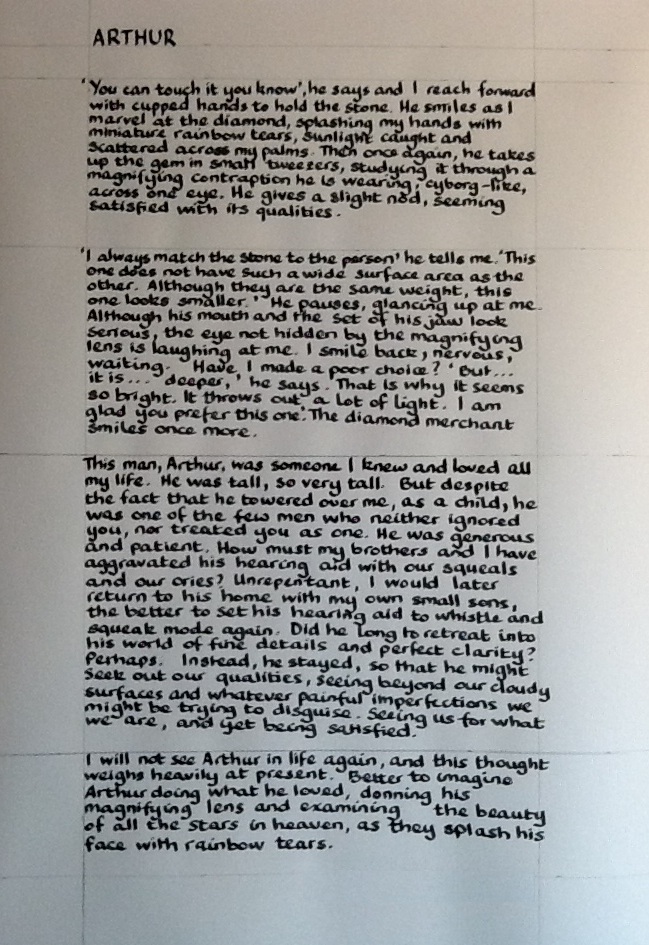
ARTHUR

'You can touch it, you know', he says and I reach forward with cupped hands to hold the stone.  He smiles as I marvel at the diamond, splashing my hands with miniature rainbow tears, sunlight caught and scattered across my palms.  Then, once again, he takes up the gem in small tweezers, studying it through a magnifying contraption he is wearing, cyborg-like, across one eye.

'I always match the stone to the person' he tells me.  This one does not have such a wide surface area as the other.  Although they are the same weight, this one looks smaller.'  He pauses, glancing up at me.  Although his mouth and the set of his jaw look serious, the eye not hidden by the magnifying lens is laughing at me.  I smile back, nervous, waiting.  Have I made a poor choice?  'But...it is...deeper,' he says.  'That is why it is so bright.  It throws out a lot of light.  I am glad you prefer this one.'  The diamond merchant smiles once more.

This man, Arthur, was somone I knew and loved all my life.  He was tall, so very tall.  But despite the fact he towered over me, as a child he was one of the few men who neither ignored you, nor treated you as one.  He was generous and patient.  How must my brothers and I have aggravated his hearing aid with our squeals and our cries?  Unrepentant, I would later return to his home with my own small sons, the better to set his hearing aid to whistle and squeak mode again.  Did he long to retreat into his world of fine details and perfect clarity?  Perhaps.  Instead, he stayed, so that he might seek out our qualities, seeing beyond our cloudy surfaces and whatever painful imperfections we might be trying to disguise.  Seeing us for what we are, and yet being satisfied.

I will not see Arthur in life again, and this thought weighs heavily at present.  Better to imagine Arthur doing what he loved, donning his magnifying lens and examining the beauty of all the stars in heaven, as they splash his face with rainbow tears.

How do you keep a perfectly straight line?

Even with lots of pencil lines to guide you, keeping a straight line when writing large sections of text is tricky.  I think having lines underneath would help, but when I tried, I couldn't see through the paper.  Perhaps I should have measured every line out and drawn it in pencil on the paper.


Attempt 2 was complete, but I managed to splash a drop of water on it when I was erasing the pencil marks
  
Here is my desk with completed work 
plus attempts 1 and 2
  
Recycle failed attempts card

Rather than waste the failed attempts, I stamped leaves all over them and turned them into a card to accompany the caligraphy.  

Ingredients for calligraphy prose poem
Parker 51
Quink blue black ink
Daler Rowney Manga Pad paper

Ingredients for calligraphy card
Santa Rosa leaf stamped on failed calligraphy attempts
Distress Ink "spiced marmalade" ink pad
Copper card stock
Letraset Metallic Marker in "red gold"
Letraset Tria Markers: green (G136), orange (O567), yellow (Y337)

Cardboard trees and sleeping cats

Cardboard tree

Cardboard birds (plus wooden duck)

My younger son and I spotted a brilliant cardboard tree which we thought would make a great addition to the boys' room.  Assembly took...rather longer than anticipated, but here it is, fully assembled on top of one of their chest of drawers.

Let sleeping cats lie

In other news, the cats have been sleeping again.  From top to bottom, Nut, Mouse and Stormy.

Tuesday 7 February 2012

2012 Art Journal, Week 4 - Cadbury's Creme Eggs

Cadbury's Creme Eggs 

Efemera says:
"This week your prompt word is SWEETS
1 List 5 sweets you remember from your childhood.  (Did you call them sweets? candies? or something else?)
2 Where did you buy them and what did they cost?
3 Include some kind of sweetie wrappers on your page"

I obviously do not read or remember the prompts as well as I should, as I quite forgot that we were meant to be listing five sweets that we remembered.  All I could think of was Cadbury's creme eggs and I suspect the heartfelt sentiment is self-evident.

Yeah, it is probably me, right?

I had a lot of fun with this page.  Unusually for me, I stamped the sweet rubber stamp in "spiced marmalade" directly onto the journal page, fully expecting it to run.  It didn't.  Yay!  I intended to create a "sweet" wallpaper effect to work against.  Next I used an egg shaped punch to cut out shapes in patterned paper and then put the Cadbury's creme egg foil behind, to look like tiny eggs.  These formed to top and bottom borders of the page.  I did the journalling in fountain pen and Staedtler triplus fineliners.

Small pound (accessorised by slightly moody queen) and a HUGE Cadbury's creme egg, like they used to be

I drew the pound coin and the large creme egg in pencil first, and then drew/outlined the details with Staedtler pigment liners of different sizes.  You can't really see it from the photo, but the pound coin is coloured using gold gel pen and gold metallic pencil.  I used a white correction pen to get the white of the Cadbury's and then Staedtler triplus fineliners (and a random yellow felt tipped pen) to colour the image in, finally outlining the sections in silver gel pen to make them stand out.  Finally, in an attempt to make them "leap" out from the page, I used the red and purple fineliners to create a halo around them.  I used the same fineliners to doodle around the borders, intending to bridge the gap between the patterned paper used for the mini eggs and the central images.

I was ridiculously pleased with how the big egg came out, especially as my partner James hadn't realised I had drawn it and thought it was just another used wrapper.  I think this has been the most fun journal page to create to date and I love the end result.

Ingredients for 2012 Art Journal, Week 4

Moleskine sketch journal
Anita's sweet rubber stamp
Distress Ink "spiced marmalade" ink pad
Patterned paper free with a magazine
Cadbury's creme egg foil wrappers
Lamy Safari fountain pen with medium nib
Steadtler pigment liners: 01, 03 and 05
Staedtler triplus fineliner set of pens: red, purple, yellow 
Zebra Jimnie gel pens: gold and silver
Pentel micro correct in white

2012 Art Journal, Week 3 - Schooldays and Doodling

Schooldays spent doodling 

Efemera introduces week 3:

"Your prompt word this week is SCHOOLDAYS
1 Jot down 10 random things about your schooldays
2 Use lined paper
3 Add some ink blots and doodle in the margin"

To begin with I cut some lined paper to fit my journal and stamped the maple leaf in Distress Ink "Spiced Marmalade".  I wanted to achieve an authentic school page look, so I found one of my old exercise books and a "back to school" titlepage produced when I was eight years old.  I cut out the title "SCHOOL" (well it was "SCHOOLS", but I ditched the 'S') and noted as I did so that my eight year old self had cunningly covered up a felt tip 'K' in SKHOOL with a 'C'.  The long suffering sticky tape had no stick left, so I glued the 'C' back in place.  In addition to the title, I managed to salvage the date and a few of the smaller, potentially recognisable items from the old drawing.  I especially liked the little doodle in black of two flowers appearing at the bottom of both the original page and the new one.  I copied that image when doodling the top and bottom borders.

I chose the colour scheme from the original drawing, adding the orange for a bit of light relief from the deep red, blue, purple and green.  My new favourite crafting things - a set of Staedtler triplus fineliner pens were great for a bit of girly journaling and a LOT of doodling.  I had to colour around the date to make the pencil writing stand out.  After highlighting that, all I wanted to do was to fill up all the free space with doodles, with the only white space being used for the ink blots.  As I only use black ink in my fountain pens, I am more accustomed to having black ink blots, but I seem to remember all school ink blots are blue...were we forced to write in blue ink in school, or was it just fashionable to do so?

I must say I had forgotten the joy of doodling.  There is something immensely satisfying and relaxing about doodling into every corner of a page.  The result is messy, but authentic and on the whole, I am pleased with it.

Ingredients for 2012 Art Journal, Week 3
Moleskine sketch journal
Lined paper
Santa Rosa maple leaf rubber stamp
Distress Ink "spiced marmalade" ink pad
Images from school exercise book I had when I was eight
Staedtler triplus fineliner set of pens: orange, red, blue, green and purple

Thursday 2 February 2012

2012 Art Journal, Week 2 - Parker Pens and Creepy Dolls

 
Gifts - best and worst

I know I am behind with weeks, but I'm hoping to catch up sooner or later.  Anyways, Efemera's prompt for week 2 is as follows:

"This weeks prompt word is GIFT
1 Your best gift? could be any occasion and any time
2 Your worst? " "
3 Include some recycled packaging/ recycled card on your page"


Being disorganised I did not have Efemera's prompt in front of me when I started the page, meaning that all I could remember was "best and worst presents".  I completely forgot about the recycled packaging/ recycled card.  Although I use recycled material in virtually every project I undertake, I think that the patterned paper I found in my scrap box came free with a magazine, so it is not recycled.  (Boo.)  Normally I would be saved by a tendency to collage, so usually at least some recylced item would have found its way into the picture, but since the Moleskine journal I use doesn't exactly lend itself to layers, so I missed out on that opportunity too.  (Dang.)

In progress

Since the artists' inks bled through the Moleskine journal pages, I am wary of the same happening with fountain pens.  For this reason, I am using different bases and sticking them into the journal afterwards.  I daubed "Sunflower" coloured ink from an pad ink around the edges of the page and then drew the pen and doll in pencil and then outlined them using Lamy Safari fountain pens (fine and medium nibs).  The journalling is done with the Parker 51 itself.

Parker 51 detail

"BEST PRESENT - My original Parker 51 with its italic nib which was given to me by my father a long time ago"

 
Creepy doll detail

"WORST PRESENT - A very beautiful porcelain doll with perfect but deeply sad features.  She looked abused.  I hated her.  I couldn't stand her looking at me.

I coloured the drawings with watercolour pencils and metallic pencils and journalled around them.  I stamped a few small images (rose, sunflower and ladybird) using a dark pink ink pad, just to break up the patterned paper a little.  The edging of the journal started as vermilion ink that had bled through the previous page, so I simply touched it up to give a (slightly more) consistent colour and stuck the patterned paper on top.

Original Parker 51 with italic nib

And here is my most treasured gift!  The fountain pen is one of a pair that my father, then a young naval officer, bought when he decided to improve his (perfectly neat and adequate) handwriting, by teaching himself italics.  He changed his handwriting completely by refusing to allow himself to write in his old style.  

When I was old enough to be interested, Dad bought me a Sheaffer calligraphy set.  I adored the Sheaffer pen set with its three different italic nibs and its brilliant booklet on calligraphy (which I believe I still have!).  I used it so much that it begun to fall apart.  Under supervision Dad had begun allowing me to write using his Parkers and one day asked me to chose one of them to keep as my own.  [Note that it isn't really advised to allow other people to use your italic nibbed pens, as they wear themselves in to your handwriting and a worn-in nib could be damaged by someone with a different writing angle.]

I chose the wider nibbed pen (silver cap) over the narrower nibbed pen (gold cap).  Vintage pens are supposed to be a mixed bag, but I have been using mine every day for 20 years and besides having a chipped top replaced and a single service by a professional for good measure, it continues to be the most lovely pen to write with that I have ever come across.  Sadly, unlike my father, I never mastered calligraphy.  My "biro-style" and "italic-nib-style" look totally different and I can't describe the later as calligraphy.  Nevertheless, I mastered a signature and I still love writing with it.

Ingredients for 2012 Art Journal, Week 2
Moleskine sketch journal
Patterned paper free with magazine
All Night Media "Sunflower" pigment ink pad
Rose and sunflower rubber stamp from same set (origin unknown) and Anita's ladybird rubber stamp
Distress Ink "Tattered Rose" stamp pad
Parker 51 fountain pen with italic nib
Lamy Safari fountain pen with fine nib
Lamy Safari fountain pen with medium nib
Caran d'Ache Supracolor soft water colour pencils: white, black, umber, scarlet
Derwent Metallic pencils: pink, silver
Windsor & Newton inks: vermilion

Monday 23 January 2012

2012 Art Journal, Week 1 - Aiming for Warhol, achieving extras in Wicked

It's not easy being green

I wanted to have a go at art journalling.  Unfortunately I am a year late for the UK Stampers Art Journal Challenge which took place over 2011.  However, Efemera's prompts there seemed so good, that I could not see any reason for following them one year later.  This is my first attempt, and...well...it wasn't what I was aming for.

Efemera's prompt for week 1 is as follows:
"A new year and a new start so this weeks prompt is GOALS, use this in anyway you wish.  Your page must include:
1 Three things you want to achieve this year

2 Handmade background paper
3 A photograph"

I am not sure whether or not the prompt was literally paper made by hand or a background to which you had contributed, as opposed to one you had just used from a designer pack.  I wanted to combine 2 and 3 to produce an Andy Warhol effect.  I found a usable photograph and then using Snapseed on the iPad and Microsoft Paint on the computer, I turned it into a tiled black and white background. 


 Me and my boys

Too many faces

I then coloured in the faces, in bright Windsor & Newton inks, Art Kure watercolour pens and Derwent watercolour pencils.  To link in with the third 'goal' I was trying to give the faces masks à la 'The Incredibles' superheroes.  However, as I was painting them, the younger of my sons pointed out that the faces just looked creepy.  He was right.


Too many creepy faces

I left three faces in black and white, both to indicate that these individuals were not behind masks, not hiding and also because there was simply no way to colour them now without them also joining the witch, troll, vampire and zombie line up.

Moleskine journal page was too porous

I did not think things could get much worse, but, of course, if it is all going badly, it is downhill all the way.   My new and expensive Moleskine sketch journal was a hopeless choice for mixed media.  Probably perfect for pencil sketches, the paper (which I had masked all round with post-it notes, proceded to suck up my inks and plaster them on the other side of the page).  Naturally the pages had not been stretched, so as soon as they dried, they took on a wave.

I stamped a few stars with a tiny clear stamp (well this was meant to be a stamping project!) and coloured those in with a Sakura gel pen, embellishing with Glossy Accents.  Finally I stuck some recycled ribbon around the edges, mainly for a bit of texture.  I used my favourite pen in all the world (an original Parker 51 with an italic nib given to me by my father) to write the journalling on separate (less porous) paper.  I tried to keep the journalling loose and informal, but I was tense by this point and it probably shows.  Finally, I set about placing the journalled pieces strategically to cover up the most scary of the faces.

Although the end result wasn't what I was trying to achieve, starting something new always involves a learning curve.  Anyway, if you rip up everything you produce that displeases you, after a while you become too paralysed with fear of failure to even attempt something new.  

Ingredients for 2012 Art Journal, Week 1
Moleskine sketch journal (good for sketches, not good for getting wet)
Microsoft Paint on the computer, Snapseed photo-editing software on the iPad
Art-Kure watercolour sketch brush pens: various colours
Windsor & Newton inks: various colours
Caran d'Ache Supracolor soft watercolour pencils: various colours
Craft central clear star stamp 
Ink It Up 'Light Chocolate' pigment ink stamp pad
Sakura 'bronze' gel pen, Inkssentials Glossy Accents
Recycled ribbon