Showing posts with label rubber. Show all posts

Thursday, 1 March 2012

Purple

Grandma

 Wider view of pages

Efemera from UK Stampers says "This week your prompt is COLOUR

1 What is your favourite colour and why?
2 Use this as your main background for your page
3 Add a doodled border to your page"

Grandma was my mother's mother.  Even in her eighties she was one of the most beautiful women in my life.  In her heyday, and standing at 5ft 7ins, she was as graceful and glamourous as any model or film star of that era.  She loved horror movies and the colour purple, and I have inherited both of these traits from her.

I took a photograph of a photograph I have of her.  Since my favourite colours are both purple and green, I chose background paper with both of these represented.  I used a corner punch on the paper and the photograph.  The rose, the wings, the title font and the chain and squares on the opposite page are all stamps.  I stamped these in a light colour and then re-coloured them all with Letraset Tria markers and gel pens.  The leaf doodles to the right of the photographs were hand drawn in the style of the rose and coloured in the same way to maintain consistency.  

The title font is made up of Woodware's Francoise Read "Francoise Alphabet" clear stamps.  I love this font and actually have three sets of the stamps to ensure that I can (nearly always) set up a whole phrase in one stamp, rather than having to stamp the letters indiviudally.  I have used gold dots everywhere, but these have not shown up especially well in the photographs.  As the page was important to me, I used the remainder background paper on the opposite page, onto which I added the poem about Arthur (a photograph of the original script).  To me, these pages honour people whom I have loved and lost.

Ingredients for Purple
DCWV Floral Prints background paper
Photograph of a photograph of Grandma
Woodware rounded corner punch
Stampers Anonymous Tim Holtz angel wings stamp
Hobby Art Surrey Stylised Rose
Distress Ink in "tattered rose"
Woodware Francoise Read "Glasgow Glass Elements" clear stamps
Woodware Francoise Read "Francoise Alphabet" clear stamps
Letraset Metallic marker in gold
Letraset Tria markers: pink O518, purples V528 and V245, greens G136 and G356
Zebra Jimnie gel pen in silver
Gold glitter gel pen (make unknown)
Pentel white gel pen
Staedtler triplus fineliners in dark blue and purple

Monday, 27 February 2012

Beware the Weeping Angels

Weeping Angels, scariest Dr Who baddies ever?

My youngest son is a HUGE fan of Weeping Angels.  If you haven't come across them before, they are Dr Who menaces who first appeared in the episode Blink, back when David Tennant was around.  Essentially they work by plunging you in the past to live out your life there, whilst they steal the energy of your potential future.  This isn't really what makes them so scary.  

They are terrifying because they can only move when you aren't watching them. "In the sight of any living being, they literally turn into stone.  And you can't kill a stone.  Of course, a stone can't kill you either, but then you turn your head away.  Then you blink.  Then, oh yes, it can...  Don't even blink.  Blink and you're dead.  They are fast, faster than you could ever believe.  Don't turn your back, don't look away, and don't blink!"

A visit to possibly the loveliest store in London Blade Rubber Stamps (opposite the British Museum) saw me spending far too much and buying some new rubber stamps.  The main feature of this card is an Aubrey Beardsley angel, from Blade's own collection.  It was obviously crying out to be a Weeping Angel, so I made it one.  The torn wallpaper message is also a reference to Blink, where the heroine of the episode is warned by finding a message under ancient wallpaper in an abandoned house.

Inside the card - really duck Sally Sparrow, duck now

As cards go, this one took me a while.  It was difficult to get the different elements to gel.  As soon as I put the message on the front, it stood out too strongly and stole from the angel.  I used Tria markers on the angel image and background to try to link the pieces with colour, but the angel still seemed to drift into the background.  I solved this by using Glossy Accents on the angel to make it stand out.

Ingredients for Weeping Angel
Beardsley Angel stamp - Blade Rubber Stamps
Distress Ink in "chipped sapphire"
"Wallpaper effect" paper free from a magazine, matted onto black/gold tissue card offcut (and black/gold tissue paper inside)
Letraset Metallic marker in green
Letraset Tria markers: pink R327 and green G136
Pentel Chinese calligraphy brush pen
Zebra Jimnie gel pen in silver 
Inkssentials Glossy Accents

Tuesday, 14 February 2012

2012 Art Journal, Week 5 - Perfect Day

Perfect Day

Efemera from UK Stampers had the following to say about Week 5:

"This week's prompt is PERFECT DAY
1 What is/ would be your perfect day?
2 Include a picture on your page
3 Use some stamping on your page"

I like to tone my photographs down a little if I am using them in collage work, as they can appear a bit too bright and "I'm-a-photograph-look-at-me" for journal work or card making.  It really depends on the look you are trying to achieve, but here, I wanted a more vintage effect.  I used Snapseed on the iPad to make the picture of James and Storm "vintage" and the picture of the boys "dramatic".  After printing these out, I used circular and oval punches on them, triming the sides of James and Stormy to be able to fit the keys in.

I was aiming for vintage and can trace the brown and orange colour scheme back to a card of Beanie's on UK Stampers, whilst the lime green contrast colour was a fashion website influence, Escada maybe...all too expensive for my blood, but beautiful to look at.  Having stamped the keys and clocks, I did the main journalling.  I felt the background still wasn't broken up enough, so I stamped various smaller round and oblong stamps among the keys and the journalling.  Then I begun doodling.  I doodled on every part of the page and loved every moment of it.

Ingredients for 2012 Art Journal, Week 5
Moleskine sketch journal
Key, clock and various round and oval stamps from various sources (I'm sorry, I just don't know where any of them came from, there are no markings on them) 
Distress Ink ink pads in "spiced marmalade" and "tattered rose"
Microsoft Paint on the computer, Snapseed photo-editing software on the iPad
Staedtler triplus fineliner sets of pens (colour and pastel): brown, steel, orange and lime green

Tuesday, 7 February 2012

2012 Art Journal, Week 4 - Cadbury's Creme Eggs

Cadbury's Creme Eggs 

Efemera says:
"This week your prompt word is SWEETS
1 List 5 sweets you remember from your childhood.  (Did you call them sweets? candies? or something else?)
2 Where did you buy them and what did they cost?
3 Include some kind of sweetie wrappers on your page"

I obviously do not read or remember the prompts as well as I should, as I quite forgot that we were meant to be listing five sweets that we remembered.  All I could think of was Cadbury's creme eggs and I suspect the heartfelt sentiment is self-evident.

Yeah, it is probably me, right?

I had a lot of fun with this page.  Unusually for me, I stamped the sweet rubber stamp in "spiced marmalade" directly onto the journal page, fully expecting it to run.  It didn't.  Yay!  I intended to create a "sweet" wallpaper effect to work against.  Next I used an egg shaped punch to cut out shapes in patterned paper and then put the Cadbury's creme egg foil behind, to look like tiny eggs.  These formed to top and bottom borders of the page.  I did the journalling in fountain pen and Staedtler triplus fineliners.

Small pound (accessorised by slightly moody queen) and a HUGE Cadbury's creme egg, like they used to be

I drew the pound coin and the large creme egg in pencil first, and then drew/outlined the details with Staedtler pigment liners of different sizes.  You can't really see it from the photo, but the pound coin is coloured using gold gel pen and gold metallic pencil.  I used a white correction pen to get the white of the Cadbury's and then Staedtler triplus fineliners (and a random yellow felt tipped pen) to colour the image in, finally outlining the sections in silver gel pen to make them stand out.  Finally, in an attempt to make them "leap" out from the page, I used the red and purple fineliners to create a halo around them.  I used the same fineliners to doodle around the borders, intending to bridge the gap between the patterned paper used for the mini eggs and the central images.

I was ridiculously pleased with how the big egg came out, especially as my partner James hadn't realised I had drawn it and thought it was just another used wrapper.  I think this has been the most fun journal page to create to date and I love the end result.

Ingredients for 2012 Art Journal, Week 4

Moleskine sketch journal
Anita's sweet rubber stamp
Distress Ink "spiced marmalade" ink pad
Patterned paper free with a magazine
Cadbury's creme egg foil wrappers
Lamy Safari fountain pen with medium nib
Steadtler pigment liners: 01, 03 and 05
Staedtler triplus fineliner set of pens: red, purple, yellow 
Zebra Jimnie gel pens: gold and silver
Pentel micro correct in white

2012 Art Journal, Week 3 - Schooldays and Doodling

Schooldays spent doodling 

Efemera introduces week 3:

"Your prompt word this week is SCHOOLDAYS
1 Jot down 10 random things about your schooldays
2 Use lined paper
3 Add some ink blots and doodle in the margin"

To begin with I cut some lined paper to fit my journal and stamped the maple leaf in Distress Ink "Spiced Marmalade".  I wanted to achieve an authentic school page look, so I found one of my old exercise books and a "back to school" titlepage produced when I was eight years old.  I cut out the title "SCHOOL" (well it was "SCHOOLS", but I ditched the 'S') and noted as I did so that my eight year old self had cunningly covered up a felt tip 'K' in SKHOOL with a 'C'.  The long suffering sticky tape had no stick left, so I glued the 'C' back in place.  In addition to the title, I managed to salvage the date and a few of the smaller, potentially recognisable items from the old drawing.  I especially liked the little doodle in black of two flowers appearing at the bottom of both the original page and the new one.  I copied that image when doodling the top and bottom borders.

I chose the colour scheme from the original drawing, adding the orange for a bit of light relief from the deep red, blue, purple and green.  My new favourite crafting things - a set of Staedtler triplus fineliner pens were great for a bit of girly journaling and a LOT of doodling.  I had to colour around the date to make the pencil writing stand out.  After highlighting that, all I wanted to do was to fill up all the free space with doodles, with the only white space being used for the ink blots.  As I only use black ink in my fountain pens, I am more accustomed to having black ink blots, but I seem to remember all school ink blots are blue...were we forced to write in blue ink in school, or was it just fashionable to do so?

I must say I had forgotten the joy of doodling.  There is something immensely satisfying and relaxing about doodling into every corner of a page.  The result is messy, but authentic and on the whole, I am pleased with it.

Ingredients for 2012 Art Journal, Week 3
Moleskine sketch journal
Lined paper
Santa Rosa maple leaf rubber stamp
Distress Ink "spiced marmalade" ink pad
Images from school exercise book I had when I was eight
Staedtler triplus fineliner set of pens: orange, red, blue, green and purple

Monday, 23 January 2012

2012 Art Journal, Week 1 - Aiming for Warhol, achieving extras in Wicked

It's not easy being green

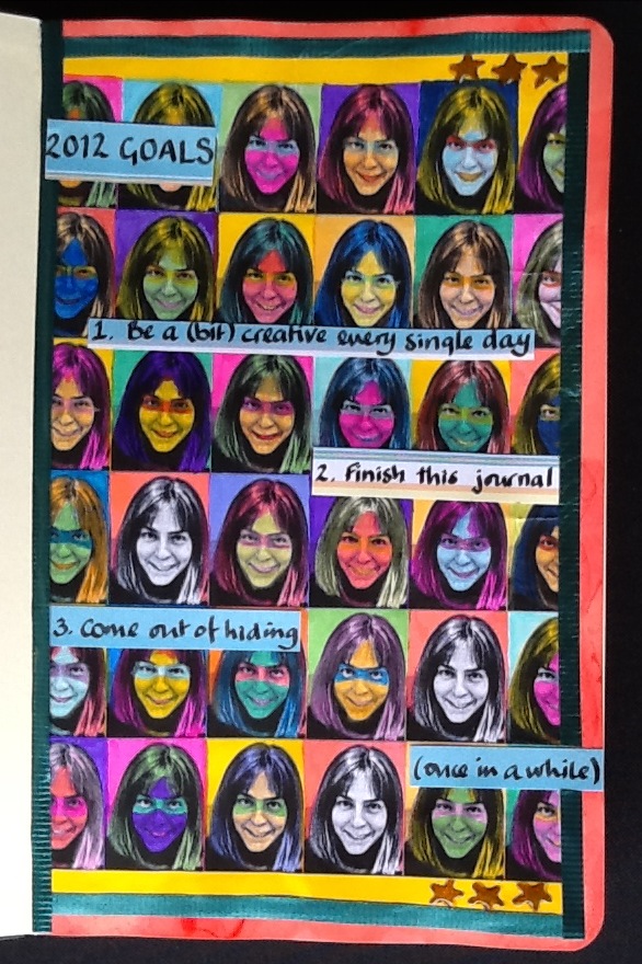
I wanted to have a go at art journalling.  Unfortunately I am a year late for the UK Stampers Art Journal Challenge which took place over 2011.  However, Efemera's prompts there seemed so good, that I could not see any reason for following them one year later.  This is my first attempt, and...well...it wasn't what I was aming for.

Efemera's prompt for week 1 is as follows:
"A new year and a new start so this weeks prompt is GOALS, use this in anyway you wish.  Your page must include:
1 Three things you want to achieve this year

2 Handmade background paper
3 A photograph"

I am not sure whether or not the prompt was literally paper made by hand or a background to which you had contributed, as opposed to one you had just used from a designer pack.  I wanted to combine 2 and 3 to produce an Andy Warhol effect.  I found a usable photograph and then using Snapseed on the iPad and Microsoft Paint on the computer, I turned it into a tiled black and white background. 


 Me and my boys

Too many faces

I then coloured in the faces, in bright Windsor & Newton inks, Art Kure watercolour pens and Derwent watercolour pencils.  To link in with the third 'goal' I was trying to give the faces masks à la 'The Incredibles' superheroes.  However, as I was painting them, the younger of my sons pointed out that the faces just looked creepy.  He was right.


Too many creepy faces

I left three faces in black and white, both to indicate that these individuals were not behind masks, not hiding and also because there was simply no way to colour them now without them also joining the witch, troll, vampire and zombie line up.

Moleskine journal page was too porous

I did not think things could get much worse, but, of course, if it is all going badly, it is downhill all the way.   My new and expensive Moleskine sketch journal was a hopeless choice for mixed media.  Probably perfect for pencil sketches, the paper (which I had masked all round with post-it notes, proceded to suck up my inks and plaster them on the other side of the page).  Naturally the pages had not been stretched, so as soon as they dried, they took on a wave.

I stamped a few stars with a tiny clear stamp (well this was meant to be a stamping project!) and coloured those in with a Sakura gel pen, embellishing with Glossy Accents.  Finally I stuck some recycled ribbon around the edges, mainly for a bit of texture.  I used my favourite pen in all the world (an original Parker 51 with an italic nib given to me by my father) to write the journalling on separate (less porous) paper.  I tried to keep the journalling loose and informal, but I was tense by this point and it probably shows.  Finally, I set about placing the journalled pieces strategically to cover up the most scary of the faces.

Although the end result wasn't what I was trying to achieve, starting something new always involves a learning curve.  Anyway, if you rip up everything you produce that displeases you, after a while you become too paralysed with fear of failure to even attempt something new.  

Ingredients for 2012 Art Journal, Week 1
Moleskine sketch journal (good for sketches, not good for getting wet)
Microsoft Paint on the computer, Snapseed photo-editing software on the iPad
Art-Kure watercolour sketch brush pens: various colours
Windsor & Newton inks: various colours
Caran d'Ache Supracolor soft watercolour pencils: various colours
Craft central clear star stamp 
Ink It Up 'Light Chocolate' pigment ink stamp pad
Sakura 'bronze' gel pen, Inkssentials Glossy Accents
Recycled ribbon

Sunday, 22 January 2012

Seahorse Birthday Card

Seahorse birthday card for William

My brother William is mentally handicapped.  He likes happy colours, especially bright, joyful pink.  Accordingly, in anything I make for Will, I always try to include a bit of pink.  The year before last I knitted him a forest green scarf, which included pink details at the edges.

The background of this card is a combination of pattern origami paper, a dark blue piece of insurance advertising literature (guess whose insurance has just come up for renewal?) and offcuts.  I layered a few pink, red, purple and gold offcut/recycled anenomes on the the background.  Then I stamped and embossed the seahorse, before backing it and hanging it on ribbon.  The embossing was weak (perhaps the embossing ink is getting a bit old), so I touched up sections with gold ink.  I then covered the background section in recycled pink netting and layered over that with more anenome pieces.  The sentiment came free with a magazine, but I jazzed it up with Glossy Accents.  Finally, I mounted everything on pearlescent blue cardstock.

When the card is held, the seahorse on its ribbon (and the seahorse's googly eye) both move behind the rustling anenomes and the netting, which I am hoping invokes an underwater feel.  If I am honest, I think that the colours and patterns are too diverse, too disjointed to work as a whole and overall the image is way too 'cute' for my liking.  That said, I think William will like it, and that is all that really matters.

Ingredients for Seahorse:
Foam seahorse stamp (no details on the stamp itself but I am fairly sure I got it from Craft Central)
Top Boss 'Tinted' embossing stamp pad, Stamp-n Stuff 'Jewelled Gold' embossing powder, heat tool 
Windsor & Newton 'Gold' ink
Cardstock in pearlescent blue, Dekon origami paper, recycled/off cuts card and paper
Recycled ribbon, recycled netting 
Lakeland googly eye
Free-with-a-magazine sentiment
Inkssentials Glossy Accents, Uhu glue, doublesided sticky tape